.png)
I prepared a proposal of three UX changes with the greatest impact on conversion. I focused on streamlining purchasing processes and optimizing sections that realistically reduce the load on the customer service team.
Working daily in the Speckable team, I constantly notice elements that can be designed better, both in terms of user experience and business benefits. I actively participate in improving our store, suggesting changes in individual sections. I base solutions on knowledge from the field of UI/UX, my own observations, feedback from customers, and competitor analysis in our industry.
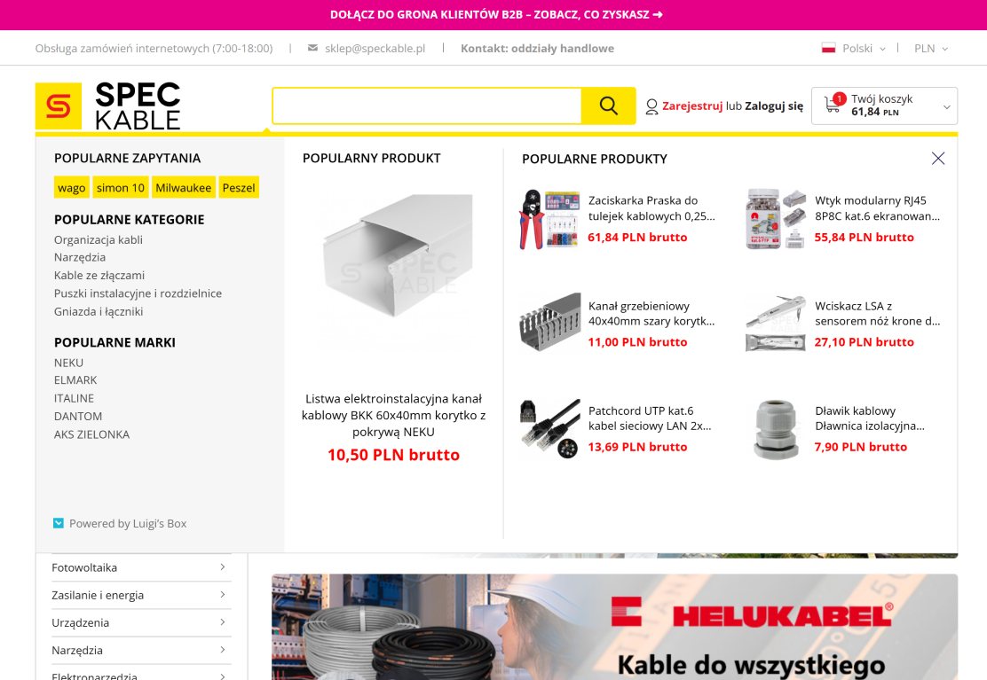
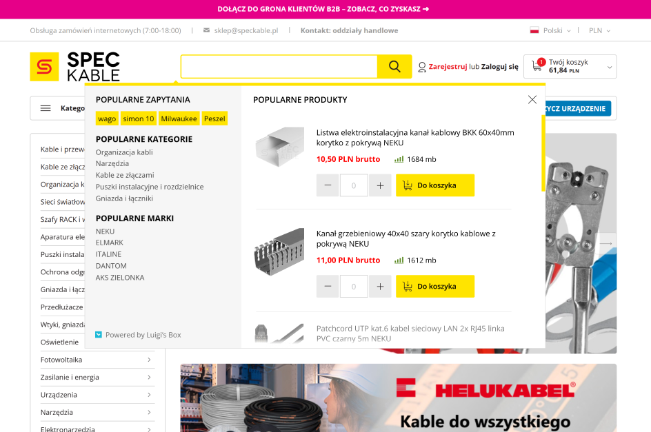
The current search works correctly, but it does not allow users to add a product to the cart and complete the purchase directly from the search results. Because of this, the purchasing process is extended by two additional steps, while it could easily be reduced to one. The search also does not display product availability, which could already be visible after searching for a specific item.
The main goal is to reduce the time needed to purchase products. This improvement is designed for customers who already know what they need and make repeated purchases on the website. They should be able to immediately add products to the cart and check availability. Visible stock levels are also helpful for the sales and customer support teams, as product availability shown on the website is often used during conversations with customers.
Leaving the search in its current form extends the purchasing process and forces users to navigate to each individual product page in order to add items to the cart. As a result, the entire process takes longer.
The search results should allow users to specify quantity and add products directly to the cart. Next to the quantity input and add-to-cart button, product availability should be displayed. This allows users to quickly assess whether the product is in stock at a glance.
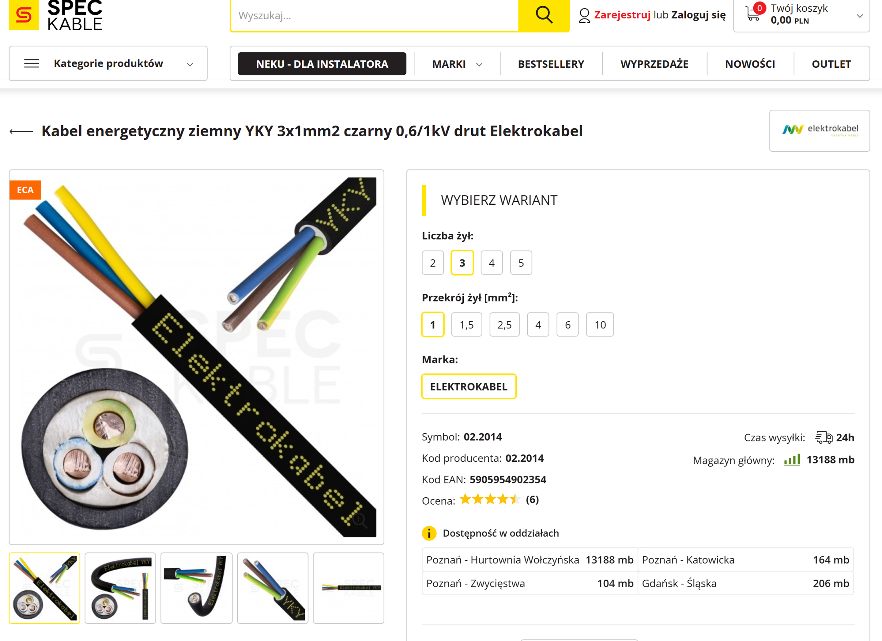
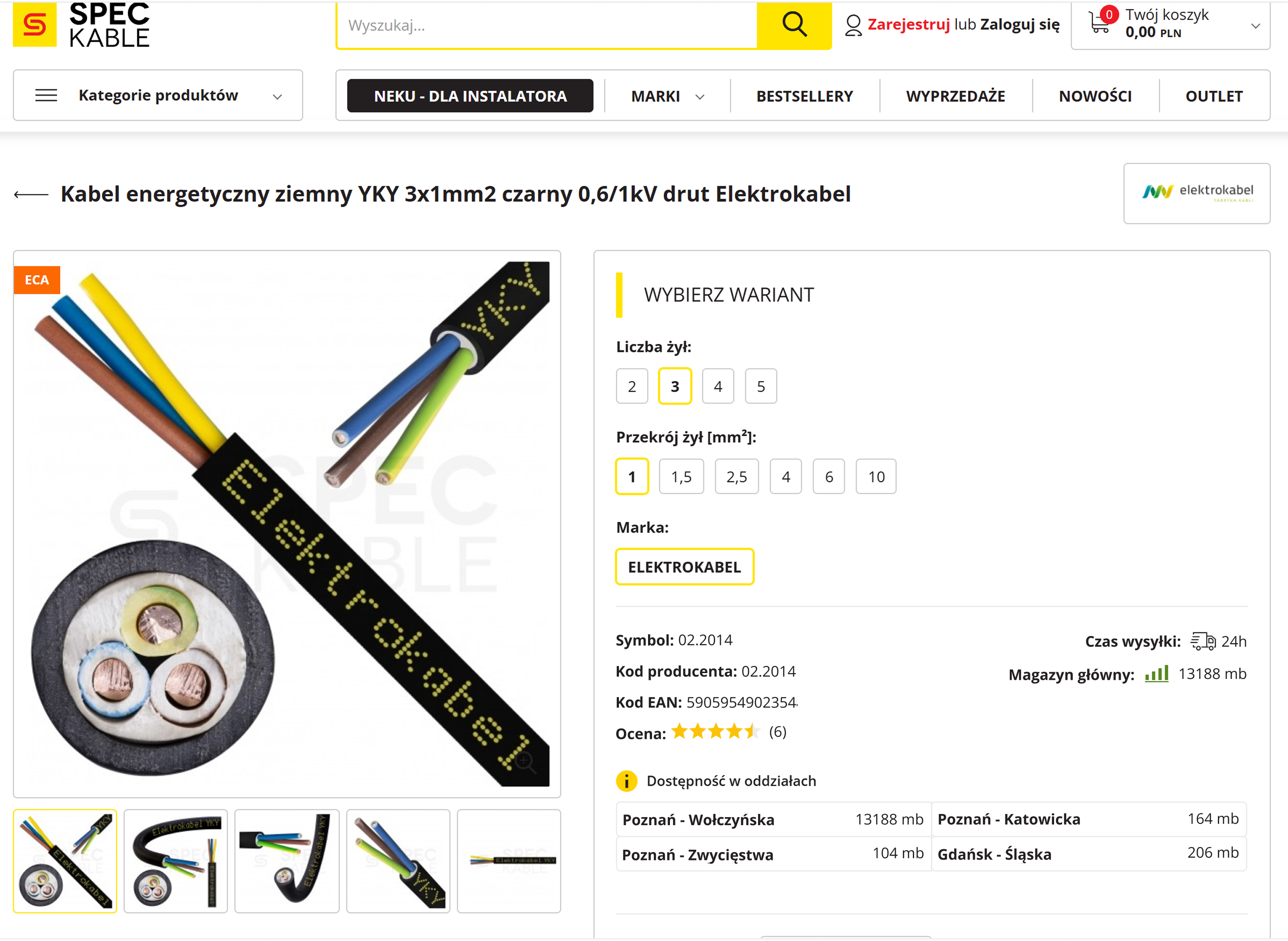
During customer calls, I observed that users have a major problem finding the product symbol. When asked for it, they often need step-by-step instructions on where to look. The same applies to technical parameters customers don't notice them at first glance. As a result, they are forced to contact us by phone, even though all the necessary information is already visible on the page.
If we design an interface in which we know the user will be looking for a label, it will make sense to emphasize the label instead of its data. This will apply even more to a store and a product page because we have a large amount of data for the product specification. For example, if a user is trying to find the case width, they are likely browsing the page in search of words such as 'width', not '500mm'.
Leaving labels in their current form leads to significant information-seeking friction, resulting in incorrect orders, increased returns, and a higher volume of customer support inquiries via email or phone. Furthermore, it creates communication barriers during consultations, as users often see raw data or product symbols without the necessary context of a clear label.
All labels for data such as product specification or technical product specification should be bolded. For example, labels such as: symbol, manufacturer code, EAN code, or reviews should be bolded. Thanks to this, it will be easier to scan the page in search of needed information for the specification and its potential availability.
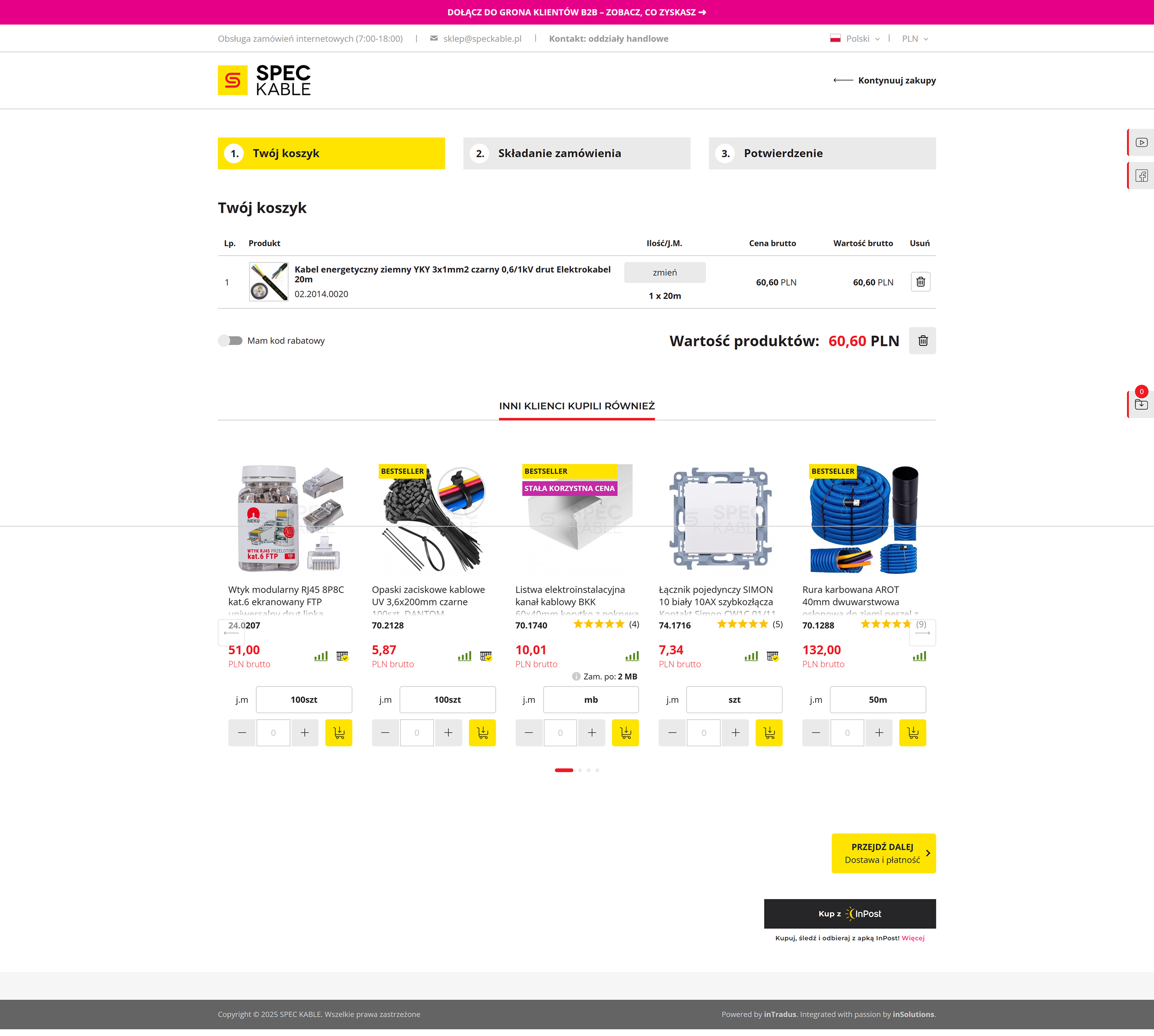
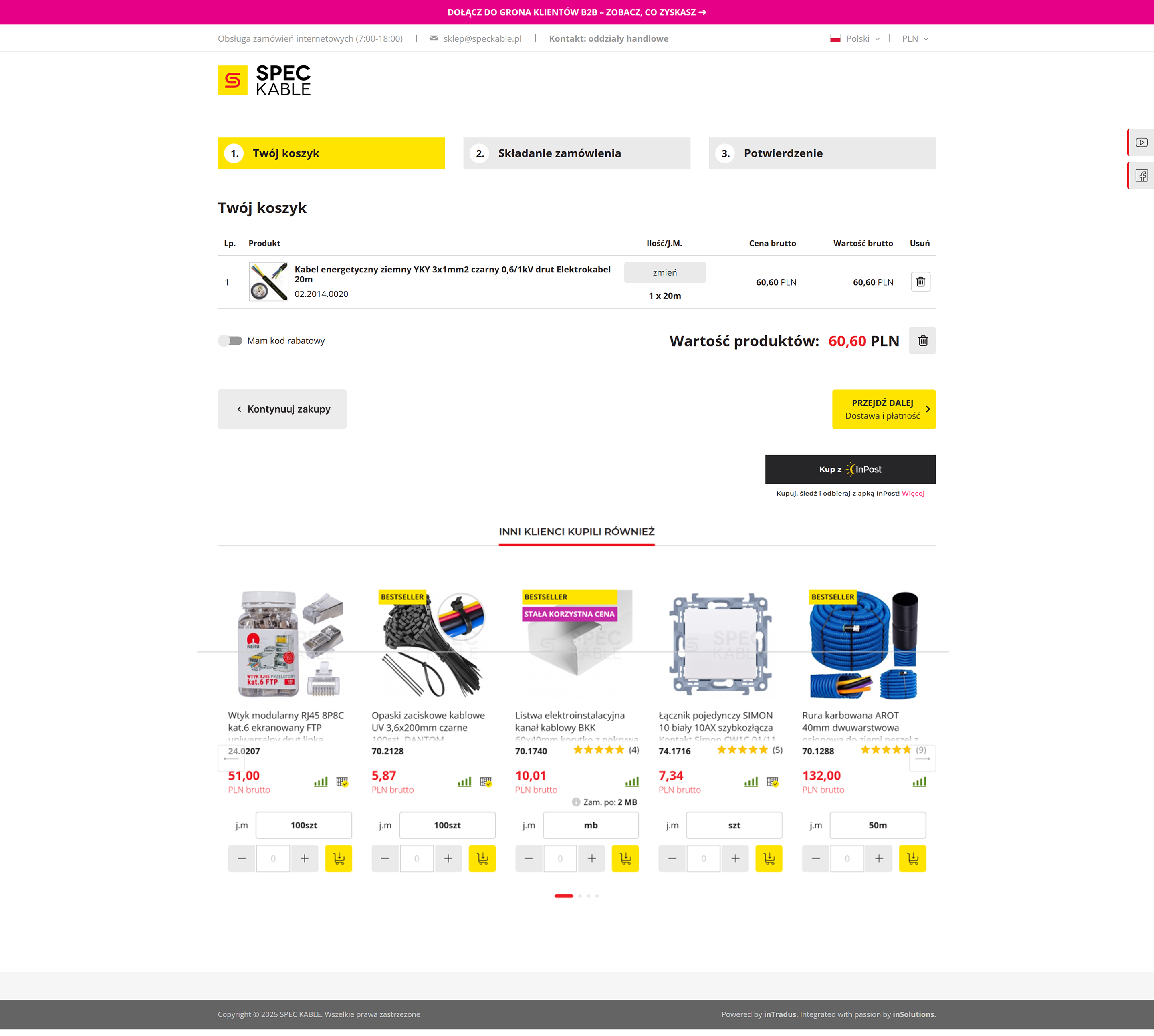
A customer using a standard screen resolution does not immediately see the 'Proceed' button because it is covered by the 'Other customers also bought' section. As a result, the customer has to wonder if they should scroll the page to find the button for continuing the order. All of this slows down the purchase and burdens the customer because they have to start wondering how to proceed further to the purchase.
In the purchasing process, key buttons (CTA), such as “Proceed,” should be easily accessible and visible without the need to scroll the page. If a customer has to search for a button, wondering if they should scroll down, they may experience fatigue from using the site and irritation. The purchasing process should be as smooth and intuitive as possible, because it is the most important stage of an online store.
Leaving the layout as it is may result in a greater burden on the customer and irritation due to the need to search for the button to proceed. This increases the risk of cart abandonment already at the initial stage of placing an order.
The main button (CTA) 'Proceed' should be placed directly under the cart summary, above the 'Other customers also bought' section, so that it is visible immediately after entering the page. Additionally, it is worth placing the 'Continue shopping' button on the left side, next to the 'Proceed' button. Thanks to this, the layout will be more legible, and the customer will not waste time scrolling and searching for the button.
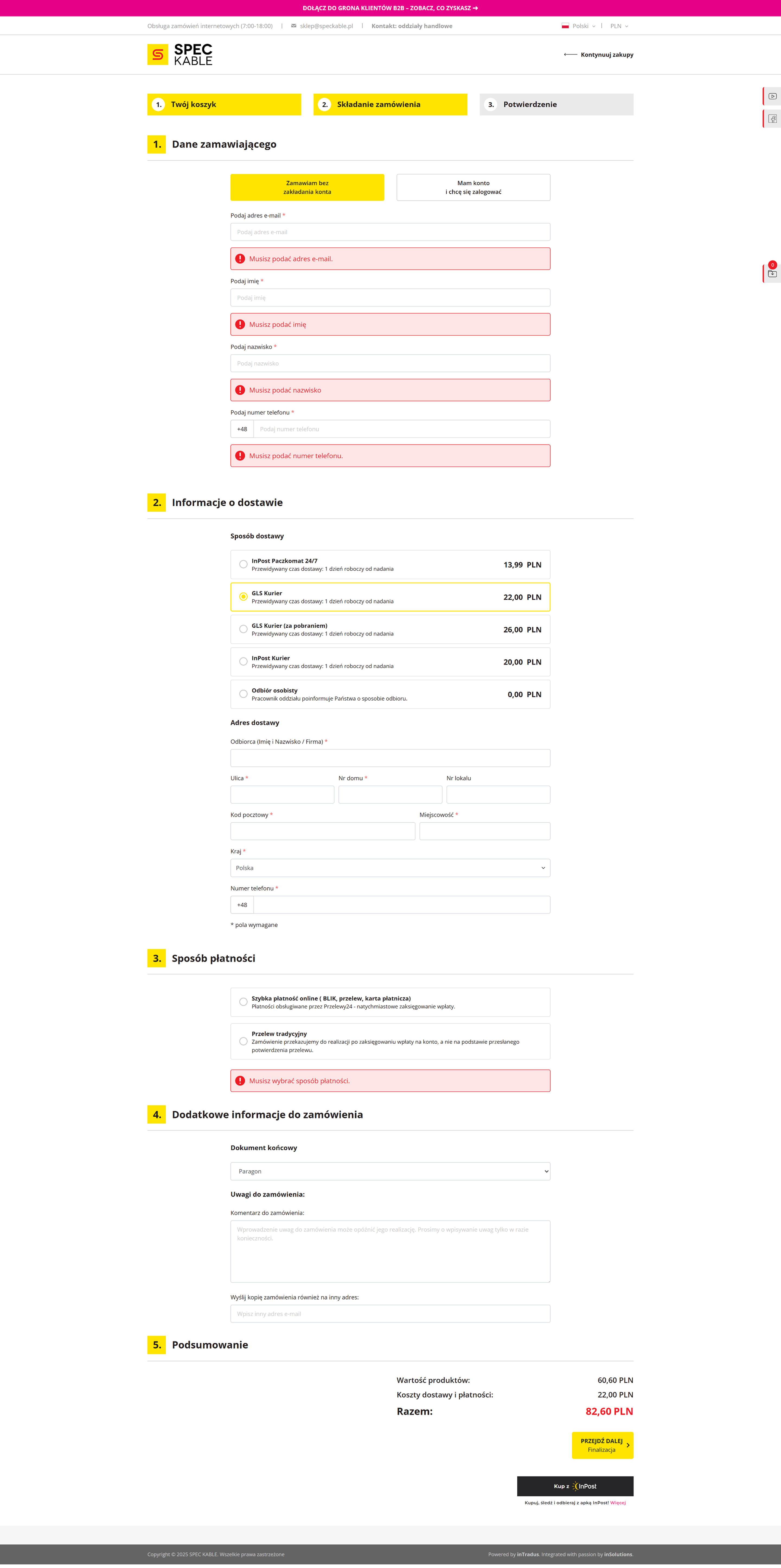
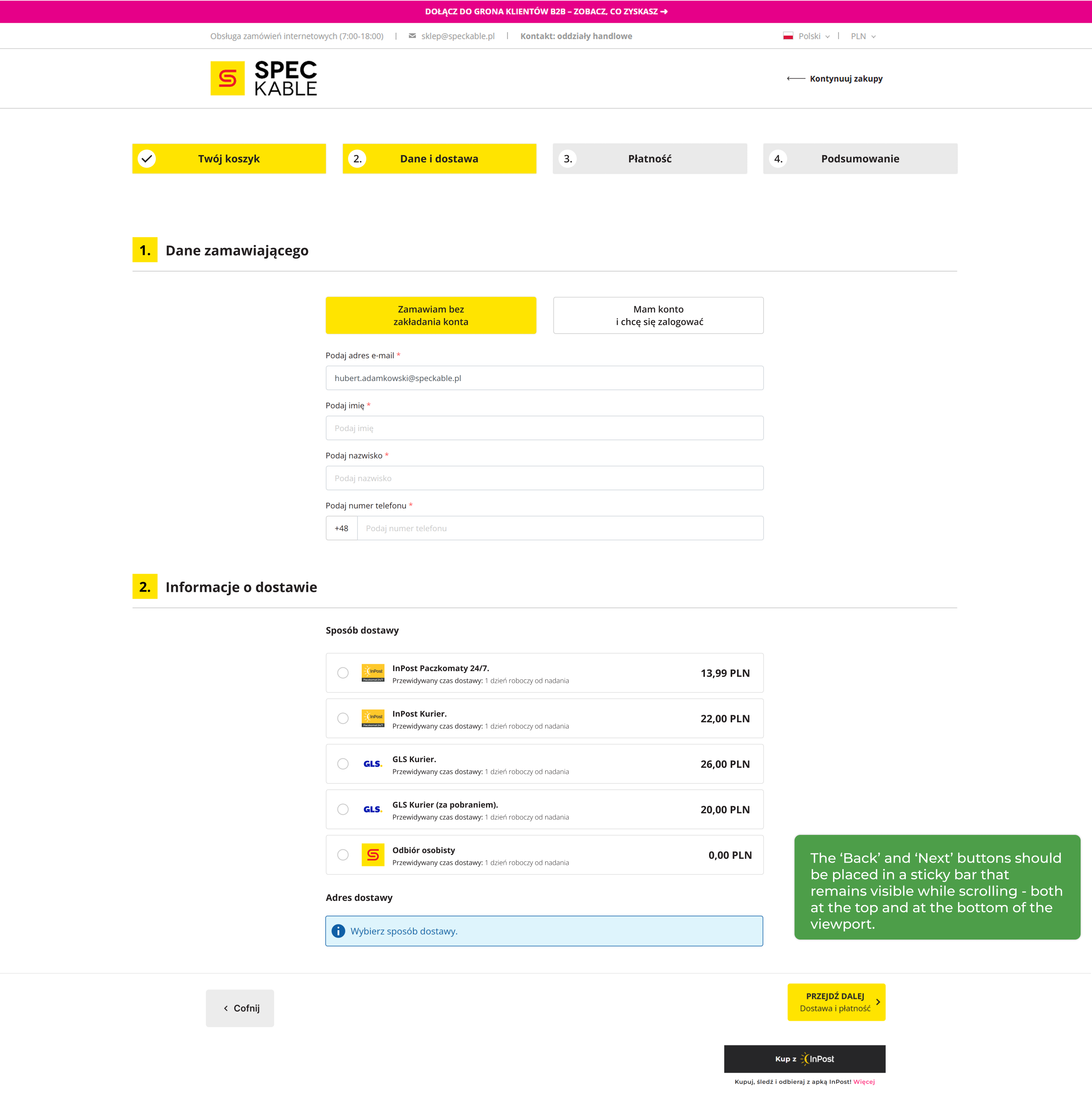
Analyzing website reviews and customer phone calls, I repeatedly received feedback that the checkout form is too overwhelming for a single page. Many customers struggled to complete their details, particularly getting confused about where to enter shipping addresses versus company invoice data. Because they couldn't place orders quickly and smoothly online, users resorted to emailing or calling in their orders, directly increasing the workload for the customer service department.
Users feel more confident when the purchasing process is divided into smaller steps and they have a clear progress preview. A long, uniform form causes fatigue and forces scrolling, which lowers the comfort of use. Additionally, the lack of a 'Back' button limits the possibility of easy error correction, and the lack of graphics for payment and delivery methods makes it difficult to quickly recognize available options.
The current layout slows down the order placement process and increases user fatigue. The lack of breakdown into stages makes it difficult to correct errors, and the lack of a 'Back' button forces going back in the browser, which raises concerns about data loss. All of this increases the risk of frustration and cart abandonment.
Dividing the process into four stages: Cart → Data and Delivery → Payment → Summary. Each step should contain only necessary information and be ended with 'Next' and 'Back' buttons. Thanks to this, the process will be smoother and more predictable. These buttons should be in a sticky bar, visible during the entire scrolling time - both at the top of the view and while scrolling down.