
.png)
I completed the redesign project of the Automation Trader homepage as part of my professional internship at the Crafton agency. My task was to propose a new, fresh graphic concept that would better meet the users’ needs and the specifics of the e-commerce industry.
I analyzed the weak points of the original design and redesigned it to meet today's e-commerce standards.
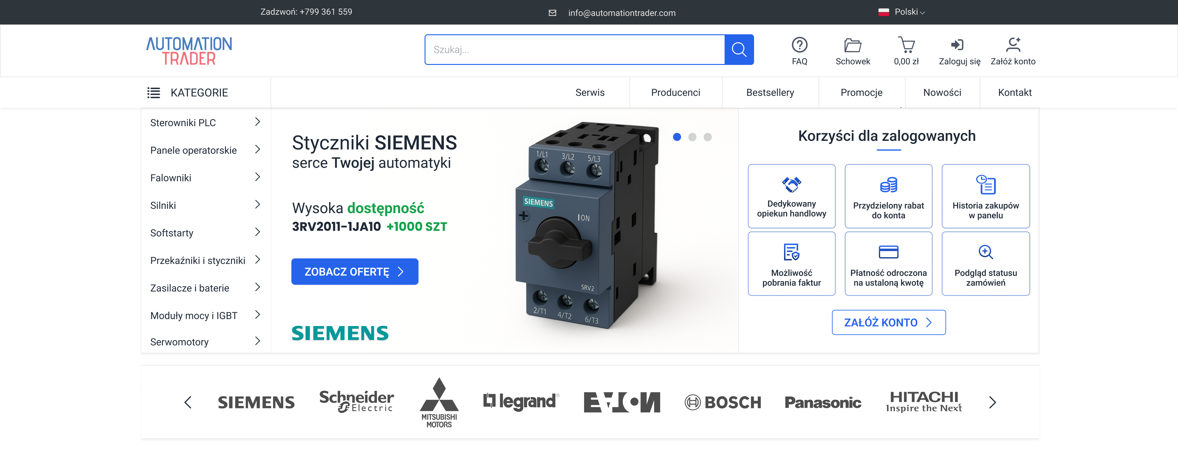
I noticed that their products were completely missing from the homepage, making it impossible to quickly scan what they sell and what they have to offer. I proposed a new homepage where customers can instantly see sample products and categories.
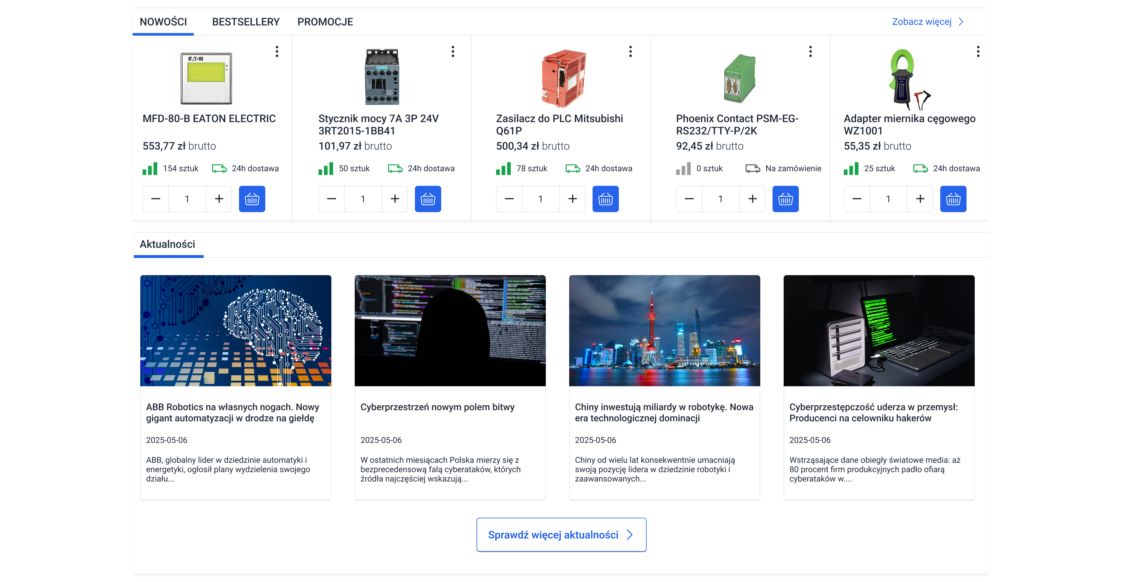
The second section I designed featured promotions, new arrivals, and bestsellers. The original homepage didn't highlight that these categories even existed.
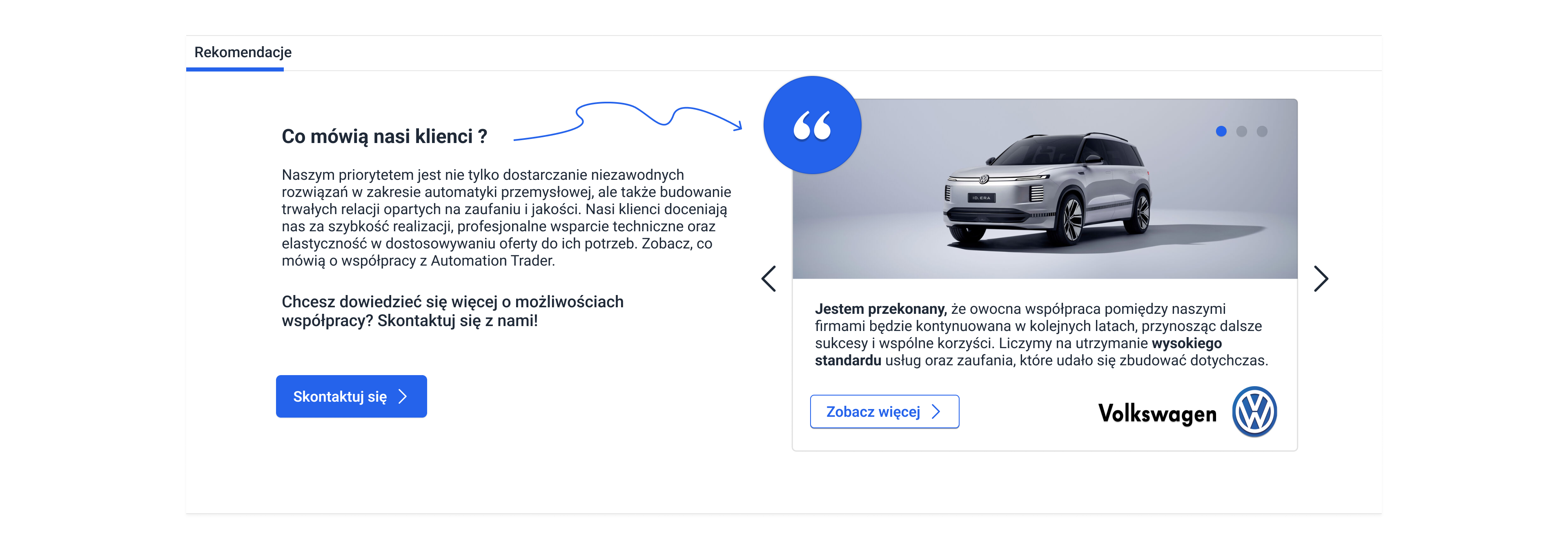
I designed a dynamic layout for the client testimonials so they actually catch the user's eye.
%201.png)
Here is the homepage before my changes and improvements.
.png)
And here it is after my redesign :)